Holly Day
Visual ID & Website
Sometimes the smaller projects are the most fun, and often helped by collaborating with talented, kind and appreciative clients. This visual identity was very much one of these, as well as being what is commonly known as a ‘brand refresh’ or ‘evolution’.
As a leader in the field of talent acquistion Holly was clear she wanted to build a simple and iconic visual system that would appeal directly to her audience, whilst also reflecting the skill of what she does, her dedication to a personal service, as well as incorporating a little bit of warmth and optimism so intrisic to her unique personality.
As a leader in the field of talent acquistion Holly was clear she wanted to build a simple and iconic visual system that would appeal directly to her audience, whilst also reflecting the skill of what she does, her dedication to a personal service, as well as incorporating a little bit of warmth and optimism so intrisic to her unique personality.
Role
Design, Art Direction & Website Build
Collaboration with
Holly Day
Design, Art Direction & Website Build
Collaboration with
Holly Day
 Before -
Nice colours but geometrically unbalanced and spaced
Before -
Nice colours but geometrically unbalanced and spaced
After - Bespoke & geometrically balanced logo icon and stamp
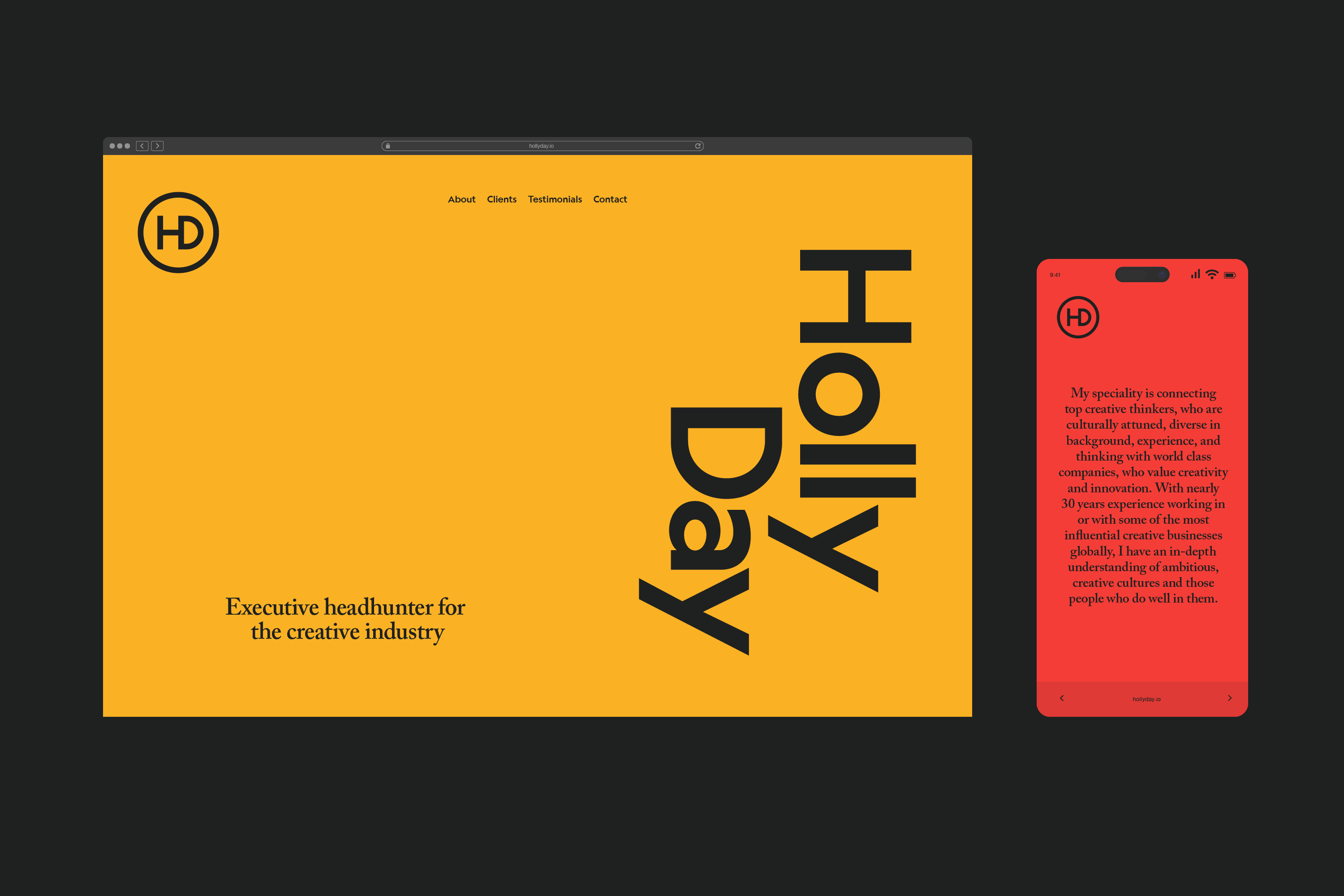
We decided to build on the equity of the visual elements that already existed, but refine them to provide a more pleasing set of visual devices that would work with greater flexibility into the future. Her logo icon was recut to be more refined and versatile as a symbol, stamp, and signoff that would help to act as a unifier across all her stationery and touchpoints.
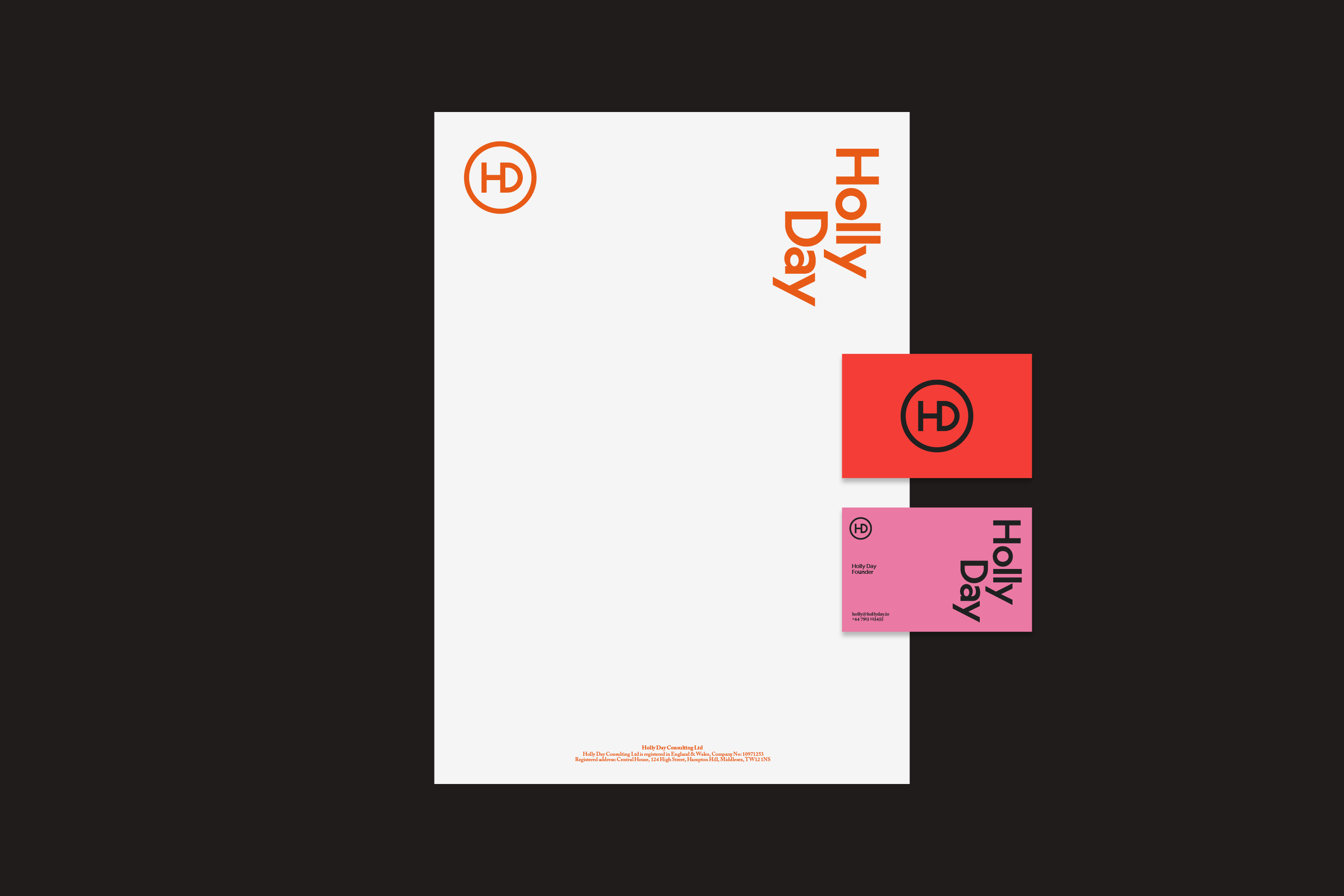

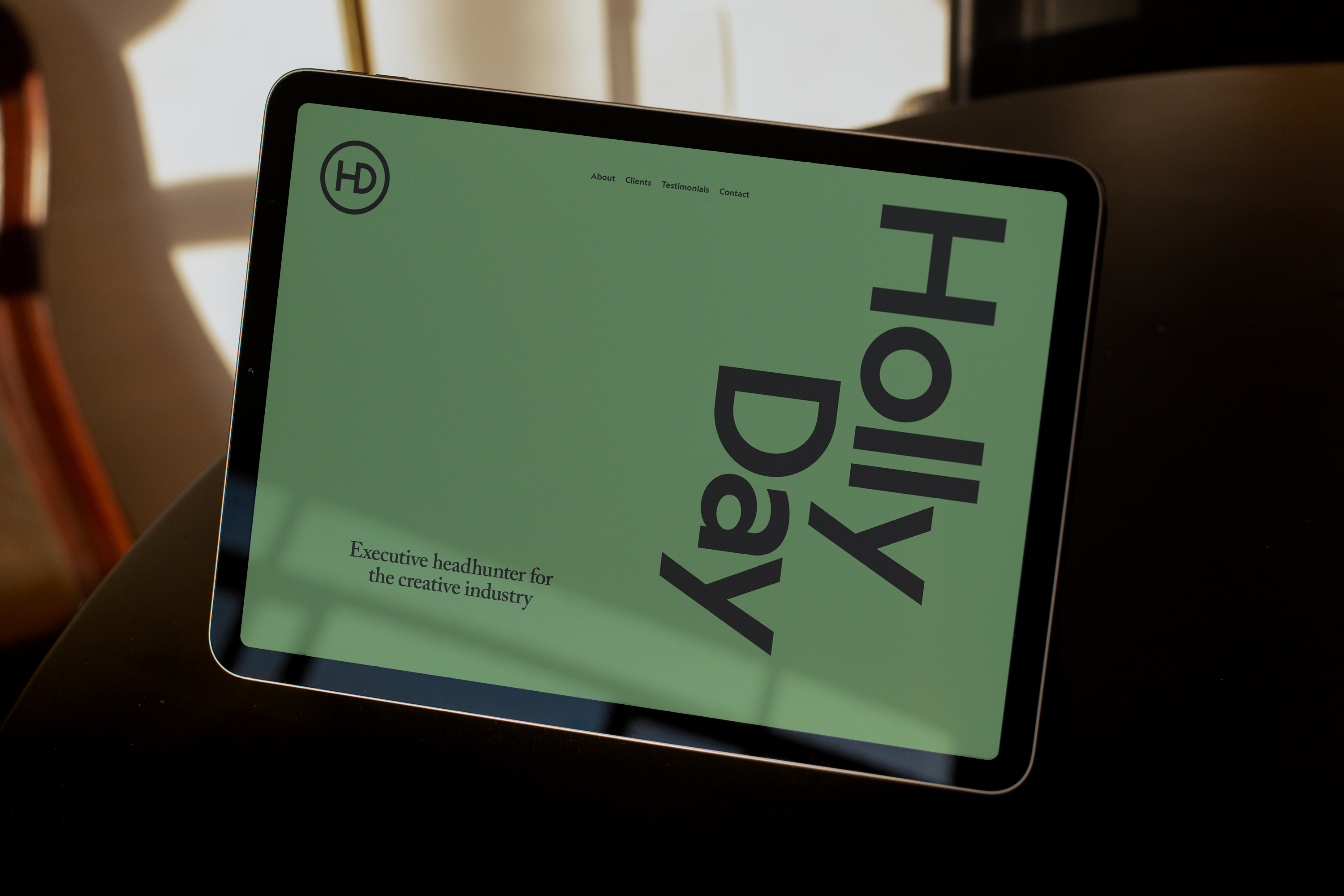
Geograph from Klim Foundry helped to provide a modern but also humanist touch to Holly’s wordmark and stationery titling - The typeface is influenced by Futura - one of Nike’s longstanding brand fonts, who conveniently and historically has been a client of Holly’s from her days at Wieden + Kennedy, and then talent sourcing for the Nike Foundation. We paired Geograph with Adobe Caslon, a typeface recognised for its longstanding reliablility in providing warmth and friendliness to any story or service.
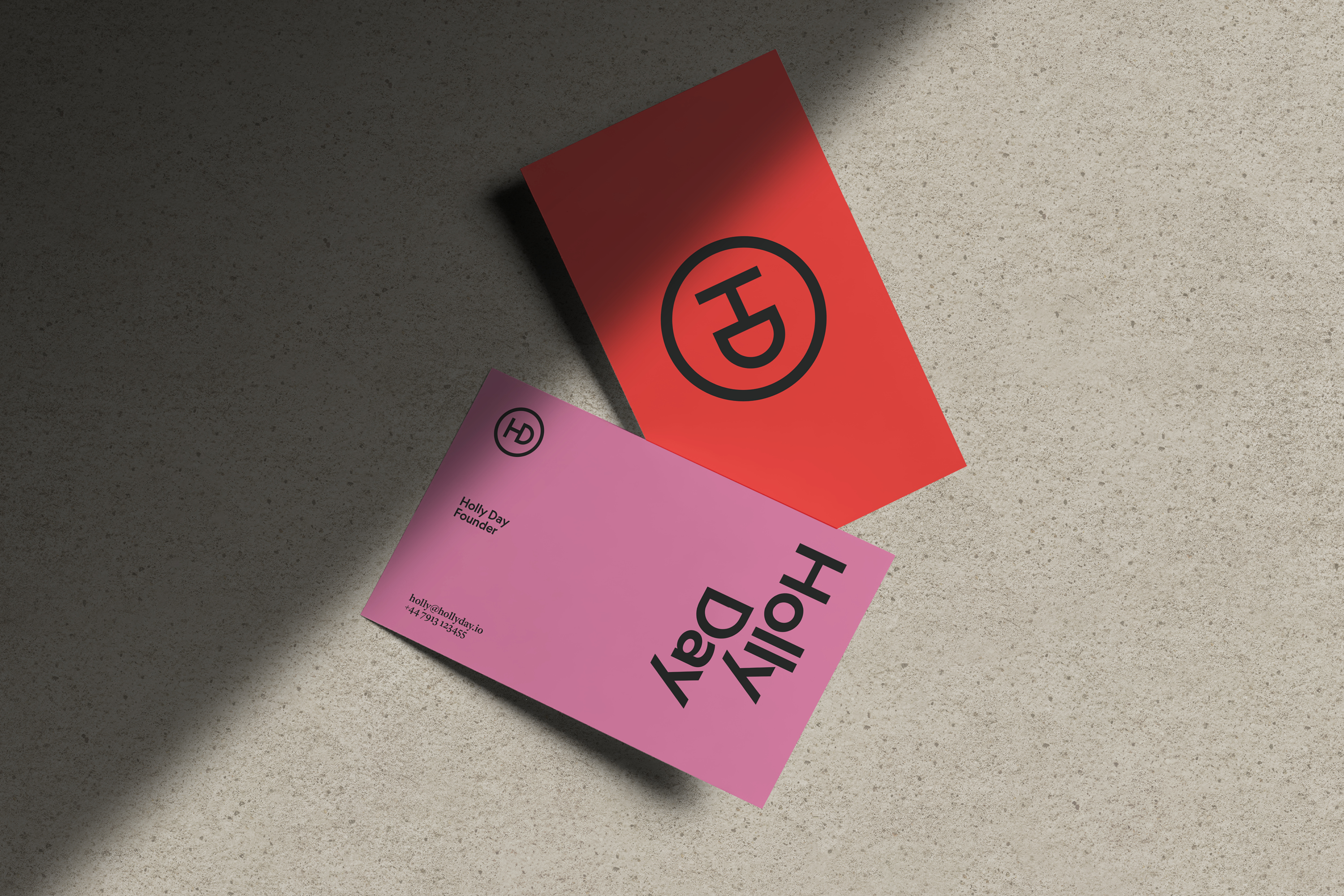

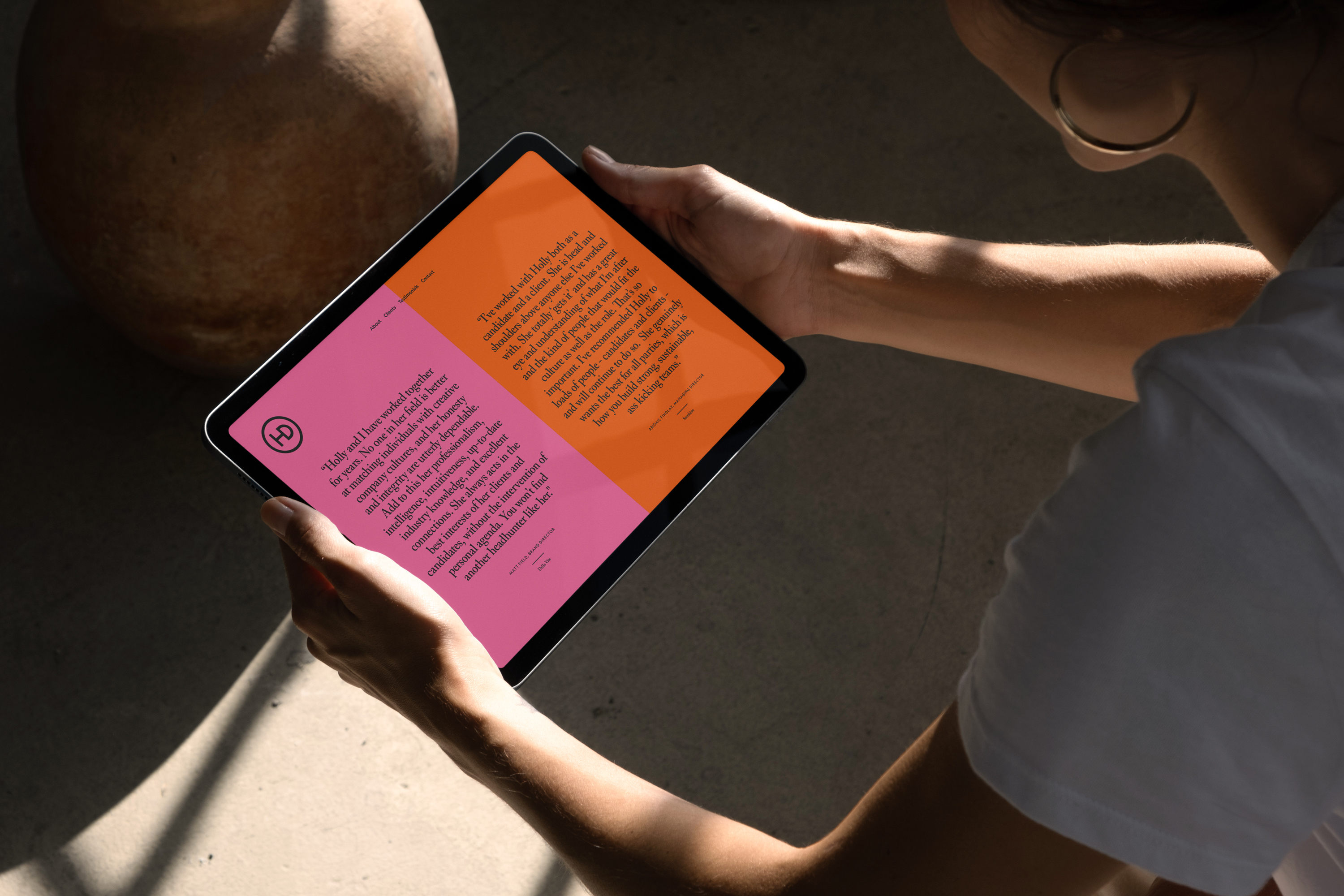
Our approach to colour became all about making relationships, pairings and groups that felt like they were ‘meant to be’. We decided this approach could sometimes include colours that clashed or contrasted if the tension was still pleasing and the chemistry felt good.
So a colour strategy of consciously creating natural and delightful matches that were lifting and brought joy, was very much designed to reflect Holly’s role as a headhunter, and her dedication to providing clients with candidate matches that help to elevate the wider team within their organisation or creative agency.
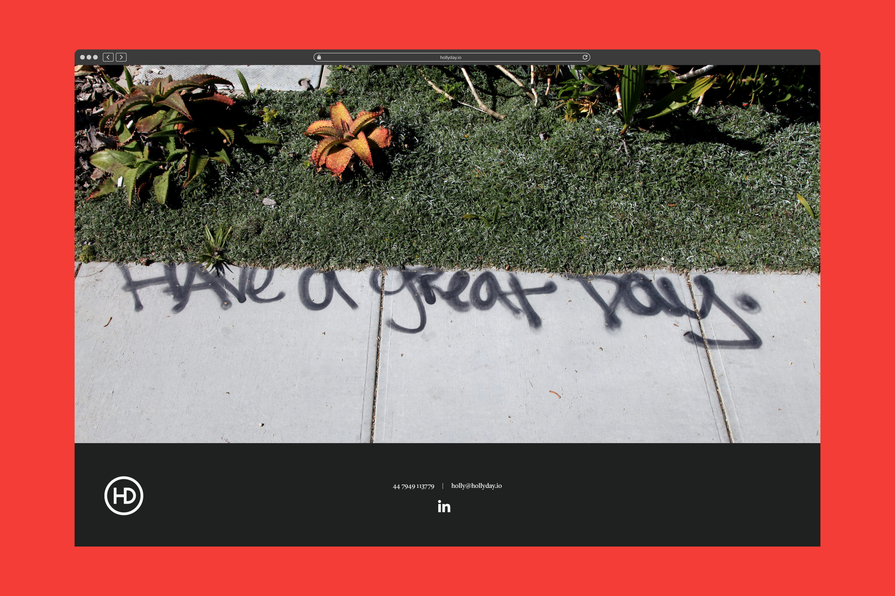
The result is a very simple idenity that can be successful across a wide variety of applications, with plenty of potential to keep evolving into the future.